User can expect their SAP systems to give them an instinctive experience where the system is used pragmatically with senses just like the user interface of any other well-designed app. I will use this blog entry to dive deeper into how a successful SAP user experience is designed for the mobile world where users are rarely found working from their desks.
A modern SAP user experience is heavily based on Fiori user experience solutions. User interface elements offered by Fiori offer a scalable experience and enable work on desktop machines as well as on tablets and smart phones. This is important as many professions are no longer attached to a single location of work. A warehouse employee covers several miles in a day around the warehouse, so it is important the employee has a simple, mobile and real-time solution for data input and inspection. Professional and executive workers might find it frustrating that even some of the simplest procedures are not mobile device compatible. What if they could be?
I’ve listed 5+1 points that introduces you to the creation of a mobile Fiori user experience:
User paths and stories
Whether you are designing a vast enterprise resource planning solution or a simple application to share, for instance, recipes, every user experience design begins with understanding what is the application’s purpose and how do people who will use it experience it. In other words, a user experience designer is not the user.
In this research phase, user habits are analyzed, and different user profiles are created which will aid in the design process. Moreover, it is possible to compare your ideas to similar Fiori applications that have been previously created and are available. For instance, SAP’s prototyping tool offers a gallery of prototypes that can be used to brainstorm ideas.
The vital part, nevertheless, is that the Fiori user interface designers have a clear understanding of the organization’s strategies, business and processes.
Only the essential
If you have ever used SAP GUI as your user interface, you may have noticed that various screens contain a lot of fields and other elements that are rarely used. Because of this, some users have found the experience to be confusing and the purpose of some functions have remained vague. In the design phase, such irrelevant elements are disregarded from the application. The application will only have elements that are necessary and comprehensible.
Data input should be automated to the largest extent, and it is recommendable to import data from different interfaces. With certain technical prerequisites, Fiori applications can be built upon existing SAP back-ends but the “fiorization” offers a chance to upgrade entire systems at the same time and holistically inspect your organizational processes and business needs.

Designing Fiori structures
A Fiori user experience is designed to be as scalable as possible. With scalability, the user interface adapts to the screen size enabling easy use on any device. User interfaces must be designed with scalability in mind right from start and, for instance, consider element placement such as button locations so that they are easily accessible on mobile touch screens. Furthermore, navigation functionality must be considered so that it works intuitively with both mouse and finger.
When the purpose of an application and its use cases are well understood, the application can be designed on various Fiori templates that are offered by the SAP prototyping tool. The application can be designed on an empty canvas where different elements such as calendars, forms or tables are placed so that they look good on any device.
SAP recommended templates can also be used in the design phase. These templates might come in handy for various use cases as such when a user has many task items that require simple actions in the system. The templates have been designed so that certain elements are located on specific parts of a screen and the functionality has been considered so that the user experience is the best possible for all devices. This gives and edge when starting to design an application. The use of a certain template is recognized in the initial part of the design when designers do their research.
Fiori elements: think mobile
Organizations use SAP systems for multiple different purposes in many ways. Some user interfaces require only little user inputs and are therefore simpler. Depending on organizational processes, some procedures require a lot of user input and involvement. In such scenarios, the user interface become complicated as it requires multiple different elements or even screens for transition.
Especially in the mobile world, this is to be avoided. Therefore, the use of mobile friendly elements is essential to create an intuitive user experience. For instance, filling out different forms can be executed so that only some fields are active or visible on screen. This way, the rest of the fields become available for users once the previous fields have been filled out.
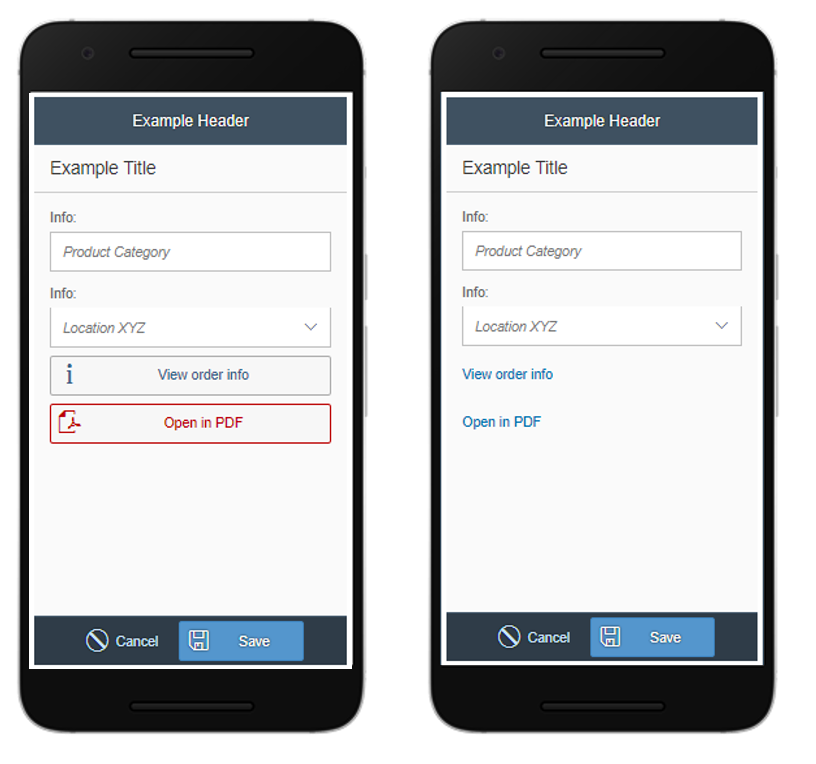
A scalable user interface is not merely a smaller version of what you see on a computer screen. Screen elements must be chosen so that they are easily accessible and clickable with a mouse and your finger. This means that the screen elements register touch effortlessly. For instance, designers can choose to use different sliders to decrease/increase value or place a clear button for navigation instead of having a clickable link which might work perfectly on computer screens.

In a mobile friendly user interface, even the simplest solutions must be carefully assessed. For instance, links that are easily clickable on computers must be reconsidered for touch interfaces and made into larger elements such as buttons.
Test, reiterate, test…
The best tool for designing a Fiori user experience is user feedback. Nothing is more frustrating than to present a user interface that no one ordered.
Both the designers and the users must understand that user experience is a process in which not only business logic is considered but also human emotions and thoughts.
This requires time and reiteration. For instance, we at ISLET design user interfaces very incrementally and we arrange several workshops with our clients where we collect feedback, observations, needs and go through new functionalities and elements.
+ Fiori is so much more
Mobile user interface design and the SAP Fiori user experience should not be approached by a single mindset where you think how a current user interface can be put into a prettier package and on multiple devices.
Even though this would be an improvement, I urge you to think above and beyond. What type of information would I appreciate to see visualized in front of me right now? How can I share real-time data across my entire team? How can I prepare my organizations user experience readiness to correspond with mega trends such as the Internet of Things.
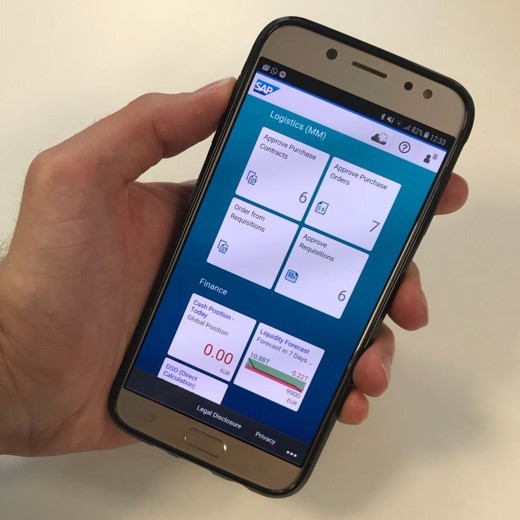
Our systems are flooded with data. With the help of Fiori, it can be simplified and visualized by, for instance, using role-based tiles on a launchpad that conveys information at a glance. Making up-to-date reports and visualizing datasets enable the comprehension of a large information pools and therefore ease decision making processes.
In a nutshell, user experience is not only how things look like – it is a powerful business tool.
To hear more, contact Heidi Sinisalo , ISLET Group’s Chief Operating Officer.
#userexperience #UX #Fiori #mobileapp #IsletGroup
